


Information About Changeable Signs
Gaining information about Changeable Signs seemed a simple task back in 2017. However, we searched high and low without luck for a supplier in the UK. Consequently, the wheels were firmly set in motion. Subsequently, readerboards.co.uk was born in 2017!
Our product is based on the American Reader Boards systems. In short, these are used extensively to promote burger deals, hotel rooms and a host of other retail promotions in the US. Readerboards has taken to their heart the idea of changeable letter systems. This is a concept that has entirely been overlooked in the UK until now.
All Things American
The founder of the company says: ‘ I was astonished that such a simple idea had not been adopted in the UK’ . I think during the explosion of reader boards in the States during the 70s, the UK was experiencing a negative tide of ‘all things American’. As a result, the UK became culturally reluctant to adopt Americanisms. However, we see all these ‘Object D’Americas’ in common place today, as a result of the global village.
Here is a List
- Huge American style fridges
- American Style police cars,
- bottled ice,
- chilled beers
- Trick and Treating
Continued….
As a result, these are now all common place in the UK. Even our treasured English dictionary has welcomed US based words. Spellings and phrases that our forefathers would have found alien. For example: Baby Showers, Elevator, Soccer, Zip codes. Consequently, the list is now endless. We want to add to this growing list the phrase ‘Readerboards.’
However, in addition to the cultural reluctance, the UK sped along with the Rest of the World with the digital convergence. Sadly, this meant the reader board became totally overlooked.
Setting Off with Developement of Changeable Signs.
At first, the trials led to production and user issues. However, eventually, the font ‘lighthouse’ was decided upon. We took inspiration from the American High school fonts. Two sizes of font were then commissioned. As a result, a printed tile was produced in late 2017, using a 700 micron plastic.
LPM Letters.
LPM 15 and LPM 22, our two first letter sizes, are a direct reference to how many letters per metre each size achieved. Moreover, they returned a visbily rebost and highly readable letter. Frank Golden, who studied Typography at the London College Of Printing explains in more detail the font’s creation.
‘When I set out to design the font, I needed to overcome one major hurdle. Each letter shape is off course different in widths. Naturally a ‘W’ will have more spacial occupancy than an ‘I’ would have. However, I needed a font that gave each letter exactly the same area to sit in. This would mean we could arrive at one tile size. This was going to be a commercial prerequisite.’
Continued….
Originally I looked at the GOTHIC font families but felt these lacked elegance and readership qualities. Next I looked into the possibility of taking a font, and individually squeezing and expanding it. We used adobe illustrator to acheive this.
The Light Bulb Moment
At first, this process proved disastrous. Most importantly, the downward strokes with varying thicknesses became distorted. This meant the font’s original proportions became distorted. Then came that light bulb moment! Earlier on in the font creation process, I looked at the US style High School fonts. These fonts opted to use straight lines to create the curves. Importantly, there were no actual curves.
Continued….
I had disregarded these as ugly and unappealing. However, my mistake here was I was looking at the font from too close a viewing point. However, I then stood away from one of these ‘square fonts’. Suddenly, the eye and brain do their bit and the straight lines vanish. Instead beautiful curves magically appear. I called upon a mate of mine who was a whiz at this type of graphic manipulation. He set to work on the project straight away.
The Final Designs.
Now we had it! A square font with no natural curves. In other words it could easily be altered without losing the original qualities. Moreover, we loved it and amazed at how easy it was to see from a considerable distance. Much further and clearer than a curved font. To that end, we named it lighthouse of course!
White and clear tiles were eventually produced with the final 39 characters. Both were cut out from the same size tile. Above all this was something that we had always required.
Bespoke Signs with Changeable Letters.
Meanwhile the tracks and boards continued to raise issues. Eventually a final version of the board with track and letters proved successful. A 2mm Perspex fascia was successfully integrated to the design. To clarify this meant the screen would not interfere with the letters. Again this was a vast improvement on the US models. They relied upon a secure poster cabinet to hold the entire sign.
This meant we could offer a tamper-proof and weather proof system. Moreover, the owner of the board would have full security over changing the message.
Continued….
Now with a highly performing outdoor product we have been able to developed the product further. We have fine tunned the 7 component parts that make up a readerboard. Also we have added more letter tiles to each of our packs of letters.
The site now have two fundamental offerings:
- Letter and track Kits
- Bespoke Signs
Further Information
- Letter and Tracks Kits.
Also known as Bundles.
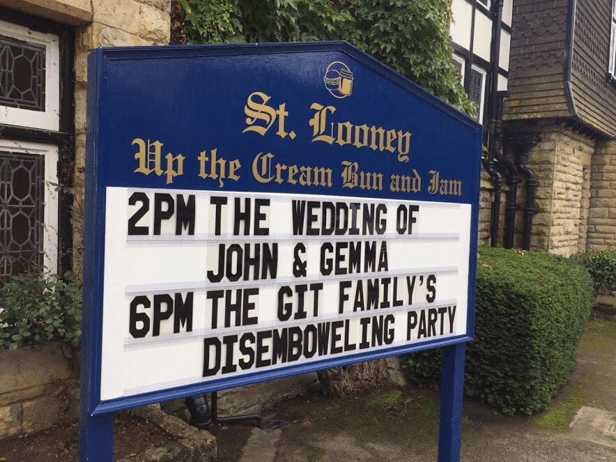
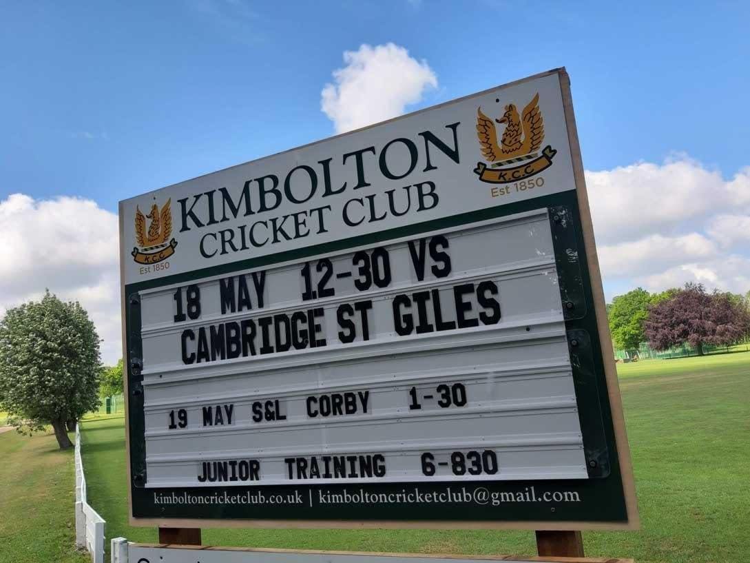
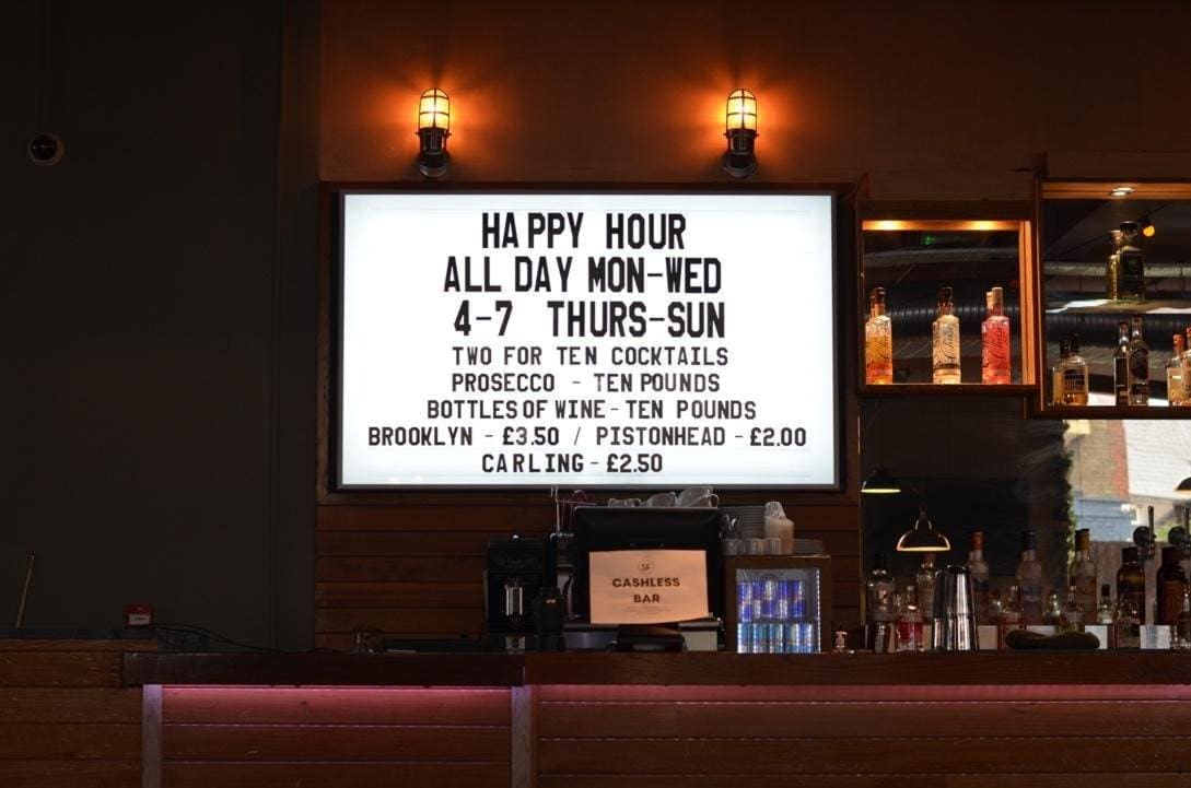
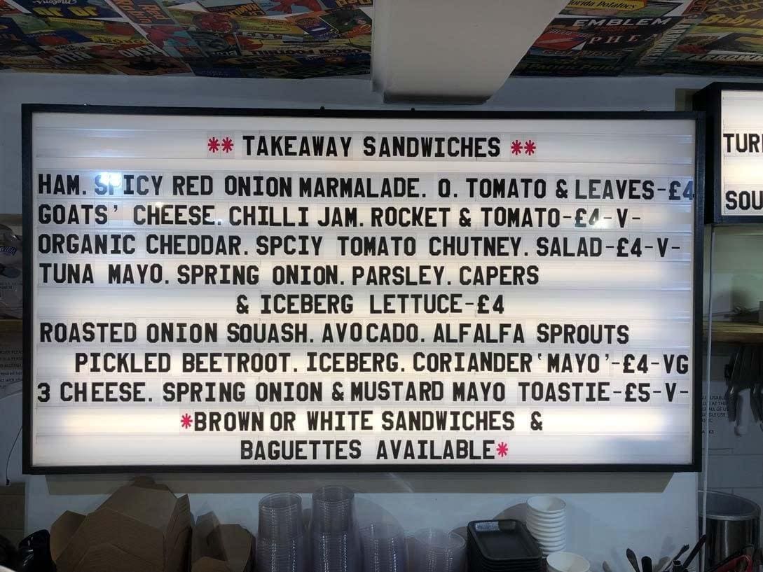
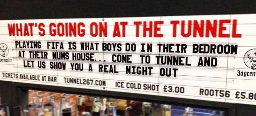
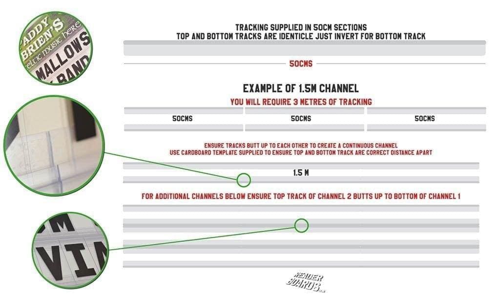
These are handy pre-assembled kits. They contain our most popular letters and tracks. These are available in all letter sizes. They are supplied with a cardboard template. This means it’s a simple task assembling your own letters and tracks onto your chosen surface. Menu boards are the ideal and most popular application. They have been used extensively in the following sectors:
- Bars
- Night Clubs
- Live Music Venues
- Coffee Shops
- Vaping Stores
- Restaurants
- Mobile Caterers